1

Of the Just Shaping of Letters — Themes and Context
(0 User reviews)
578
Project Gutenberg
2011
Not confirmed
Lettering; Alphabets; Roman capitals (Lettering)
Readers of public-domain and historical texts
Project Gutenberg digital edition
en
Edition facts
Words
13,454
Reading time
59 min
Text sections
2
Before opening Of the Just Shaping of Letters — Themes and Context, the edition data offers a quick orientation: 13,454 words, 59 min estimated reading time, and 2 detected text sections.
The text analysis averages about 20.9 words per sentence, while the detected sections provide another way to judge how the source is divided.
Project Gutenberg metadata also associates the work with “Lettering,” connecting these edition facts with the source record’s subject description.
Source:
Project Gutenberg record #37103
Albrecht Dürer's geometric instructions for constructing Roman capital letters, using compass and rule, with precise measurements and diagrams. The text moves step-by-step through each letterform, emphasizing proportional relationships and the foundational role of geometry in the graphic arts.
Editorial Edition Score
4.5/5
★★★★★
★★★★★
Calculated from edition completeness, EPUB availability, text structure and catalogue metadata. Not a user rating.
How this score is calculated
- Description quality20 pts
- Title & short description10 pts
- Source metadata20 pts
- Text length15 pts
- Chapters / structure15 pts
- EPUB file integrity20 pts
Total of 100 points, scaled to a 2.5-5.0 range. Editions with an empty description or a missing EPUB file are not scored.
Edition quality
Read the Text
Produced by Ben Courtney, Jana Srna and the Online Distributed Proofreading Team at http://www.pgdp.net
[ Transcriber's Note:
Every effort has been made to replicate this text as faithfully as possible, including inconsistencies in spelling and hyphenation. No changes have been made to the printed text. ]
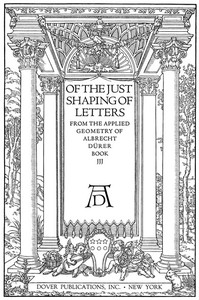
OF THE JUST SHAPING OF LETTERS
TRANSLATED BY R. T. NICHOL
FROM THE LATIN TEXT OF THE EDITION OF MDXXXV
OF THE JUST SHAPING OF LETTERS
FROM THE APPLIED GEOMETRY OF ALBRECHT DUeRER BOOK JJJ
DOVER PUBLICATIONS, INC. NEW YORK
ALBRECHT DUeRER TO WILIBALD PIRCKHEIMER HIS PATRON AND VERY GOOD FRIEND GREETING:
In our Germany, most excellent Wilibald, are to be found at the present day many young men of a happy talent for the Art Pictorial, who without any artistic training whatever, but taught only by their daily exercise of it, have run riot like an unpruned tree, so that unhesitatingly and without compunction they turn out their works, purely according to their own judgment. But when great and ingenious artists behold their so inept performances, not undeservedly do they ridicule the blindness of such men; since sane judgment abhors nothing so much as a picture perpetrated with no technical knowledge, although with plenty of care and diligence. Now the sole reason why painters of this sort are not aware of their own error is that they have not learnt Geometry, without which no one can either be or become an absolute artist; but the blame for this should be laid upon their masters, who themselves are ignorant of this art. Since this is in very truth the foundation of the whole graphic art, it seems to me a good thing to set down for studious beginners a few rudiments, in which I might, as it were, furnish them with a handle for using the compass and the rule, and thence, by seeing Truth itself before their eyes, they might become not only zealous of the arts, but even arrive at a great and true understanding of them.
Now, although in our own time, and amongst ourselves, the Art Pictorial is in ill repute with some, as being held to minister incitement to idolatry, yet a Christian man is no more enticed to superstition by pictures or images, than is an honest man girt with a sword to highway robbery. Certes he would be a witless creature who would willingly adore either pictures or images of wood or stone. On the contrary, a picture is the rather edifying and agreeable to Christian religion and duty, if only it be fairly, artificially, and correctly painted.
In what honour and dignity this art was anciently held amongst the Greeks and Romans, the old authors sufficiently testify; though afterwards all but lost, while it lay hid for more than a thousand years. It has now at length, only within the last two hundred years, by some Italians been brought again to light. For it is the easiest thing in the world for the Arts to be lost and perish; but only with difficulty, and after long time & pains are they resuscitated. Wherefore I hope that no wise man will defame this laborious task of mine, since with good intent & in behoof of all who love the Liberal Arts have I undertaken it: nor for painters alone, but for goldsmiths too, & for sculptors, and stonecutters, and woodcarvers, and for all, in short, who use compass, and rule, and measuring line--that it may serve to their utility.
Nor is anyone compelled whether or no to spend gainful hours on these exercises of mine; although I am not ignorant that whoever is well exercised in them will thence acquire not only the principles of his own art, but by daily practice, an exactitude of judgment, with which he will proceed to higher investigations & discover many more things than I have here pointed out.
But since, illustrious Sir, it is clearer than light that you are yourself, so to speak, an asylum of all the noble Arts, it has been my pleasure, out of a singular love I bear towards you, to dedicate to you this book; not because I desire to appear therein as rendering you any great service, but because thereby you may understand how engaged my mind is to you; and since by my work I can confer on you but little favour, at least by the exhibition of a ready mind I may repay the benefits you shower upon me.
OF THE JUST SHAPING OF LETTERS
FROM THE APPLIED GEOMETRY OF ALBRECHT DUeRER
Albrecht Dürer opens his treatise on letter construction with a defense of geometry as the foundation of the graphic arts, arguing that painters who lack this knowledge produce works that are 'perpetrated with no technical knowledge, although with plenty of care and diligence.' The text, translated from the 1535 Latin edition, is a practical manual: it provides detailed geometric instructions for drawing each Roman capital letter within a square grid, using compass and rule. Dürer's method is systematic, specifying exact fractions of the square for every curve, limb, and serif.
Geometry as the Foundation of Lettering
Dürer's preface, addressed to his patron Wilibald Pirckheimer, establishes a clear pedagogical intent. He laments that many young painters in Germany 'run riot like an unpruned tree,' producing works without technical grounding. For Dürer, geometry is 'the foundation of the whole graphic art,' and his lettering manual is meant to provide a 'handle for using the compass and the rule.' The text thus positions letter construction not as a decorative afterthought but as a rigorous discipline requiring precise measurement. Dürer also defends pictorial art against charges of idolatry, arguing that a picture is 'edifying and agreeable to Christian religion' if it is 'fairly, artificially, and correctly painted.' This dual emphasis—on technical precision and moral purpose—frames the entire work.
Step-by-Step Construction of Letterforms
The core of the text consists of detailed instructions for each capital letter, from A to Z. Dürer specifies exact proportions: for example, the letter S is constructed using two arcs drawn from midpoints between the square's center and its sides, with the 'maximum thickness' indicated by points p and q. The letter T is built from a vertical limb drawn 'to a point on either side below,' with transverse limbs cut obliquely and rounded with circles of 'diverse radius.' The instructions are highly procedural, often offering alternative methods—'Another method'—for the same letter. This redundancy suggests Dürer's concern for clarity and adaptability, allowing the reader to choose the approach that best suits their hand or purpose.
Recurring Motifs: Circles, Squares, and Fractions
Throughout the manual, Dürer relies on a consistent set of geometric operations: bisecting lines, drawing arcs from midpoints, and dividing squares into tenths or fifths. The letter V, for instance, requires bisecting the square's base and setting points 'one-tenth of the whole line' beyond the corners. These fractions recur across letters, creating a unified system of proportion. The compass is the primary tool, used to describe arcs that define both the outer and inner curves of letters like S. Dürer also frequently refers to 'the square a. b. c. d.' as the bounding box for each letter, reinforcing the idea that all letterforms derive from a common geometric grid. This systematic approach transforms lettering into a branch of applied geometry.
Movement Between Theory and Practice
Dürer's text moves fluidly between abstract geometric principles and concrete manual instructions. The preface defends geometry as essential to art, but the body of the work is entirely practical: it tells the reader where to place the compass point, how to cut a limb, and when to round an angle. This shift from theory to practice mirrors Dürer's own dual identity as a theorist and craftsman. The instructions are often accompanied by diagrams (referenced but not reproduced in the text), and the language is precise yet accessible—'set one leg of your compass upon the mid-point' or 'draw a vertical line r. s. to the right of e. c.' The result is a manual that is both a philosophical statement and a hands-on guide, inviting the reader to engage directly with the material.
Dürer's treatise is best approached as a workbook: read each instruction with compass and rule in hand, drawing along with the text. The alternative methods for many letters suggest that Dürer valued flexibility over rigid adherence, so experiment with both approaches. Pay attention to the recurring fractions and geometric relationships—they form the backbone of the system. The preface, though brief, provides essential context for understanding Dürer's broader artistic philosophy.
Reading Dürer’s measured instructions, I found myself thinking of the patient hands behind another craft. His precise compass feels like a quiet cousin to the steady, deliberate pressure of the Japanese woodcut, where every line depends on respect for the tool. Wood-Block Printing A Description of the Craft of Woodcutting and Colour Printing Based on the Japanese Practice — Background and Themes carries that same unhurried reverence for form, a memory of making things slowly, by hand.
There are no reviews for this eBook.
There are no comments for this eBook.
Reader reflection
What did you think of this book?
Answer a few questions and save a private reflection on this device.
Your progress
0
/
10
2
How much did you enjoy the reading experience?
3
Is this a title you would suggest to others?
4
What was the reading difficulty like?
5
How valuable was this book for your own interests?
6
Did any part of the book stay with you emotionally?
7
Did any part of the book feel personally relevant?
8
Did anything about the book feel genuinely new?
9
In one sentence, what did you learn?
10